Clinics in Korea are famous for patients’ high service satisfaction, as well as for excellence in techniques. Clinics are eager to provide patients with more comfortable and cozy environment during their visit, and interior design is one of the most prominent aspects of clinics in Korea. In this article, we would like to introduce you 4 most popular clinics among dermatology and plastic surgery clinics in Korea. These are the clinics that introduced distinctive styles to each of their lobby, waiting room, laser room, operation room and skin care room. <Editor’s note>
Lames Clinic
“Dr. Jang Sang-jae, director of Lames Clinic, paid attention to every little details, from overall design to flooring, furniture and even faucets, for the interior design of his office. The basic concept was blue and white, but the treatment room and skin care room were decorated in another style. Let’s hear from Dr. Jang himself.”

Dr. Jang Sang-jae, Director of Lames Clinic
[Advertisement] ULTRA THIN WALL NEEDLE – Manufacturer: AESPIO(www.aespio.com)
In Lames Clinic, the operation room and consultation room appear to be circulating, with the front desk at their center. The interior concept was professional look for the treatment area, and comfortable and luxurious feel for the administrative area. Lames Clinic opened at the end of May 2011, and Dr. Jang participated in the process from the early planning, by studying and doing research with the designer. He pursued complete interior design from paint color to faucets. Once entering the clinic, the first thing you get to see is the front desk, which is covered in blue, the main color of the clinic, and opaque glass is placed in front of the desk, showing the blue color of the desk through the glass. The desk is simple, with only highlight to the logo, so that patients could receive a neat impression upon entering the clinic.
On the left side of the entrance is the waiting room for consultation. In the lobby is books for patients to read and cosmetics are neatly organized, and the doctor’s profile is placed on one side of the wall. Indirect lightings are mixed with light bulbs to make the atmosphere a little softer than the entrance so that waiting patients could feel more comfortable. The consultation room was originally designed to allow skin testing, but because it takes up too much time, now the room is only for consultation, making the room somewhat larger than required. On the opposite side of the consultation room is Doctor’s office. The main blue color points back of the bookcase, the outlet of washbasin, doorknob and chair. The intensity of illumination in this room is much higher than other places so that Doctor could focus on making accurate diagnosis of patients.
On the right side of the Doctor’s office is operation/laser room, which is equipped with lasers for lifting and lipolysis as well as equipments for surgical operation. The skin care room is for 6 people. Silk clothes are draped across the narrow space between the beds to protect the patients’ privacy. The indirect lighting toward the silk makes mysterious atmosphere. Hardwood window blinds make patients feel like having a skin care in a spa of a resort.
Outside the skin care room is the waiting room for skin care, where rattan sofa is placed to continue the look of a resort.
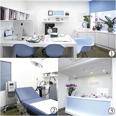
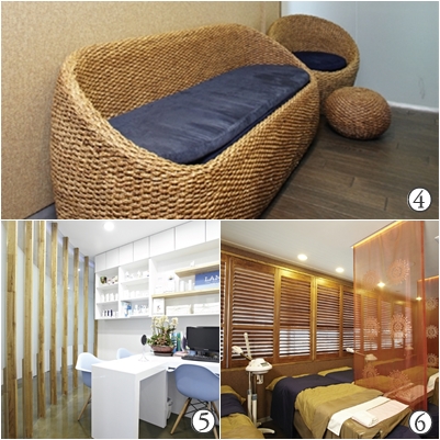
1-Doctor’s office; 2-Operation/Laser room; 3-Front desk; 4-Waiting room for skin care; 5-Consultation room; 6-Skin care room
Skyfeel Dermatologic Clinic & Aesthetic
“The basic concept of Skyfeel Dermatologic Clinic is minimalism, modernism and naturalism. The garden in the waiting room is really unique. Because the clinic uses both 3rd and 4th floors of the building, 3rd floor is dedicated to treatment, and 4th floor to skin care. Let’s hear from Dr. Choi.”

Dr. Choi Cheon-pill, Director of Skyfeel Dermatologic Clinic
If you want luxurious interior design for clinics, there is no end. Wallpaper alone has limitless number of fancy foreign brands to choose from, but such an interior design can easily become old with time. It is also too expensive to update the interior design regularly. Skyfeel Dermatologic Clinic used white color and natural wood veneers as two basic themes for minimal, modern and simple effects. Marginal spaces are supplemented with plants and vertical garden. Upon entering the clinic, the left wall of the lobby is covered in white color – antique plaster is used for luxurious look and to prevent staining – and the right side is decorated with natural wood veneers. In the waiting room is an automatic door to the terrace, which has a vertical garden, a little bit of natural atmosphere in the heart of downtown. Vases inside the clinic creates relaxed ambience like in a cafe, rather than a hospital. The vertical garden in the terrace is a very effective item for creating a garden in a tight space, and the water running from it also works as a natural humidifier. A cup of brewed coffee, the sound of running water and piano music from speakers help the patients feel relaxed while waiting for their turn.
No particular interior design was applied to the doctor’s office and laser room, except for white wall and natural wood veneer cabinets. Acne treatment room is placed next to the doctor’s office to facilitate the care. In the terrace and acne treatment room, steel-bar and stone walls create nature friendly and modern look.
The clinic uses 3rd and 4th floors of the building, 3rd floor dedicated for dermatology (lobby, waiting room, terrace and acne treatment room) and 4th floor for aesthetic skin care. Because the building is shaped like a vertically long sailboat, the 4th floor has a very high ceiling.
The corridors on the 4th floor is as unique as the structure of the building. The high ceiling is left intact in some part of the 4th floor to be used as a skin care room that can accommodate 4 people. Other areas are remodeled into a duplex, a skin care room for 3 people downstairs and a staff lounge upstairs. A spiral staircase is installed to make better use of the space.
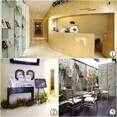
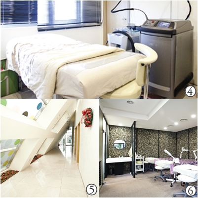
1-Front desk; 2,3-Waiting room; 4-Laser room; 5-Corridor leading to the skin care room; 6-Acne treatment room
-The end-
▶Previous Artlcle : Interior Design for Medical Clinics Ⅰ


